Timeline: 1 month
Role: UX Designer
Tools: Figma, Artboard Studio
INK
Ink is a company that believes in the impact ink to paper has on the connections between humans. To help support the ability for people to express themselves to one another, they have created a service to deliver high quality ink pens and supplies to their subscribers.
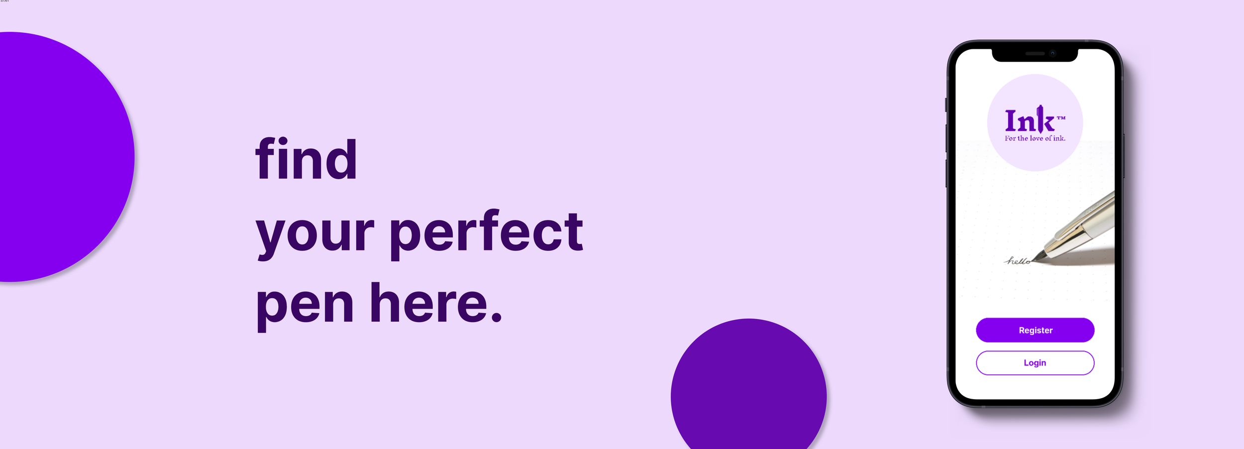
Ink had an existing app for people to use to browse, purchase, and subscribe to monthly pen deliveries. However, the Ink team noticed they were losing sales because there was no existing Login or Register feature. Users would save or like their favorite pens and then close out of the app. When they came to purchase, their information wasn’t saved, causing frustration.
The Problem
The main challenge that I was assigned to tackle was creating a positive Login (or) Registration experience for the user. I was asked to provide multiple ways for the user to login/register, such as including social media and Google accounts. Another key item was making sure the user received important feedback throughout the login/registration process to ensure a positive and successful experience.
The Challenge
How might I design a positive login experience?
Ideation
I conducted some research by first speaking with a current user of the Ink App, Alex. I wanted to get his insights as to what a positive login experience would look like. Some insights that I received during this interview were:
Making the registration/login page as accessible as possible
Providing the user with feedback to ensure their passwords match and meet the set requirements
Buttons/backgrounds/color scheme contrasts nicely against each other for better visibility
Ability to easily recover account information
Option to login/register with social accounts
User Journey Map
Implementation
I then created a Flow Diagram and implemented the feedback I received from Alex in the User Journey Map. This diagram helped me see how the actual flow of the login process would work, with the “Call to Action” buttons being highlighted blue.
For example, if Alex chooses to Login but then has trouble remembering his username and/or password, he can click on the “forgot password” button which will take him to the “Recover Account” page. Alex can enter his recovery email address and a link will be sent to his inbox to create a new password.
Flow Diagram
Wireframe Sketches
Low Fidelity Wireframes
Final Assets
Color Palette
Mockups

