Timeline: 1 month
Role: UX Designer
Tools: Figma, Artboard Studio
DESIGN SPRINT
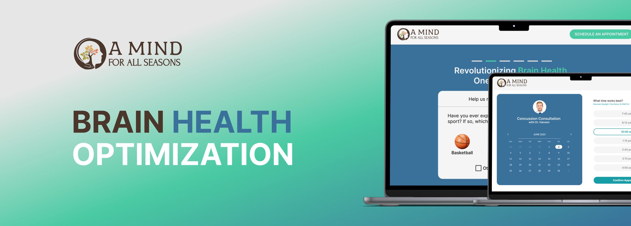
I conducted a Design Sprint for our client, A Mind for All Seasons (a local Brain Health clinic), to help student athletes be able to navigate to the concussion support page more easily and effectively.
A design sprint is an accelerated process for tackling a problem through design thinking, prototyping, and testing. Originally developed as a five-day process created by Jake Knapp at Google Ventures, the Sprint has been a successful model that any team can use to launch new user-centered products and services.
What’s a Design Sprint?
By the end of this Sprint we hope to provide the client with home page and concussion support page redesigns that will improve user experience and enhance aesthetic appeal to student users.
The Goal
User Persona
The Process
Monday
This is a look ahead at the goals for the Sprint and beyond - by starting with the end result and working backward. I explored A Mind For All Seasons’ website and looked for design opportunities or potential barriers. I captured my thoughts in a set of “How Might We?” questions:
Start at the End
Targeting allowed me to look at the product landscape in a new way and find a focal point for the project. In this section, I continued to map the user’s experience and found overlaps with the How Might We? questions from above.
Targeting
Tuesday
In this phase of the Sprint, I curated ideas from existing work for inspiration and to spark new ideas. The purpose of this was to remix and improve the ideas based on the needs of my user. I made sure not to blindly copy a design - as that is bad practice and would undermine me as a designer.
Remix & Improve Sketches
Lightning Demos
I did an online search for three companies, products, or services that have solved problems similar to the HMW questions that I was exploring. I looked at different design solutions within the healthcare/brain health industry as well as outside of it.
I selected one idea which came out the previous step that I wanted to explore a little more. In this activity, I did a “Speed Sketch” including eight variations of the same idea.
I folded a letter (8.5” x 11”) size paper four times, then unfolded it to reveal a grid with eight boxes. I set the timer for one-minute increments that repeated. I pressed start on the timer and sketched one possible variation of my idea into one of the boxes on the paper. When the timer went off, I immediately went to the next box and explored a different variation of the same idea. I repeated the process until I had a total of eight sketches.
Crazy 8’s Sketch
I then picked an variation from my Crazy 8’s activity to focus on. I focused on creating a quiz that would help users understand their symptoms and get a better idea of what kind of brain trauma they may be experiencing. I gave it a fun name, titled, “The Quesadilla Quiz”
Solution Sketch
Wednesday
After completing my Solution Sketch, I took it a step further and made a Prototype Plan. I thought of more in-depth ways to ensure my user (student athletes) would have easier access to receiving concussion treatment.
Decide
Thursday
Referring back to my Prototype Plan, I created a low-fidelity mockup of the symptoms quiz. I wanted to allow room for iterations and feedback, while still showing the main features and sequential flow of the design.
Prototype
Friday
In the table below, I created five thoughtful questions to ask my users as they interacted with my prototype. I reached out to the client, my supervisor, and my peers to receive their feedback. I recorded their positive feedback with green sticky notes; negative feedback with red, and neutral feedback with yellow.
Test & Learn
Color Palette
Final Mockups

